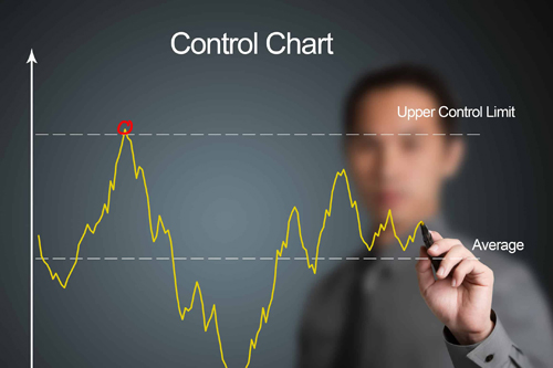
A Control Chart is a statistical tool used to monitor, control, and improve process performance over time by identifying variation. It helps distinguish between common cause variation (natural fluctuation) and special cause variation (unexpected deviation).
Key Components
- X-axis: Time or sequence of observations
- Y-axis: Measured value (e.g., defect rate, time taken)
- Center Line (CL): The average or mean value
- Upper Control Limit (UCL): Max acceptable limit before the process is considered out of control
- Lower Control Limit (LCL): Minimum acceptable limit
A Flow Chart is a visual representation of a process, showing the sequence of steps involved from start to finish. It helps identify inefficiencies, redundancies, or potential areas for improvement.
Applications
- Monitor production processes
- Identify special cause variations
- Support continuous improvement initiatives like Lean and Six Sigma
- Improve predictability and process control
Purpose
- Visualize and understand a process clearly
- Identify bottlenecks and waste
- Standardize procedures
- Train employees effectively
Benefits
- Early Detection of Process Variation
Identify issues before they become major defects or failures.
- Improved Process Stability
Helps maintain consistency by distinguishing between normal and abnormal variation.
- Supports Data-Driven Decision Making
Encourages objective analysis over assumptions or guesswork.
- Reduces Waste and Rework
By controlling variation, fewer defective products or errors occur.
- Enhances Customer Satisfaction
Stable processes lead to consistent quality and better customer experiences.

